
Designing My Store: An Influencer-Driven Marketplace Built Around Referral Monetization
The idea behind this product was to create a marketplace where individuals can become influencers or promoters, selling products by connecting directly with buyers via content, without relying on external platforms.
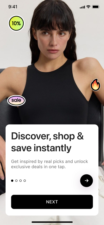
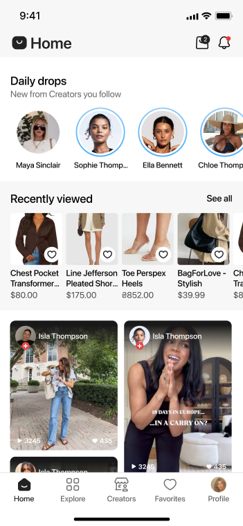
Entertainment to purchase, in one ecosystem
You’ve likely seen it before. An influencer posts a video on Instagram about a supplement that helped with their fatigue and anxiety, or an air fryer that redefined the way they cook and eat. In the corner, they add a link for buying the item. Their followers click on the link, purchase the product on the marketplace or the influencer’s storefront, and the blogger earns a commission from every sale generated through their content.
It seems straightforward; however, turning it into a full product that is scalable, structured, available, and usable by thousands can quickly become complicated.
This is where My Store comes into play. The idea behind this product was to create a marketplace where individuals can become influencers or promoters, selling products by connecting directly with buyers via content, without relying on external platforms.
It wouldn’t be done by listing items for sale or creating a catalog, but by creating promotional content (images, videos, etc.) and leading potential buyers to the seller’s webpage through a referral link. In the end, the influencer receives a commission for the sale.

The hook here is in the integrity of the system. Social media platforms usually don’t like sending users to external websites. When users click on external links on platforms like Instagram, they see warning messages like “You are about to leave Instagram.” This can create friction, reduce trust, and negatively impact conversion rates.
With My Store, the experience is designed specifically for users who have already come to the platform in the mood to discover and buy products. Instead of redirecting users away from a social platform to a third-party marketplace, the content discovery and purchasing experience happen within the same ecosystem, making the transition from entertainment to purchase feel much more natural and seamless.
The client came to us at Weelorum with a vision; however, they lacked the structure necessary to build that product. There wasn’t a clearly defined product architecture, they had no UX strategy, and there was no design concept.
As a result, before development could begin, we had to determine what this product actually was.
Project Overview
Services: Product discovery, UX/UI design, brand identity, product architecture. The objective was to create a solid design and product framework before we started writing any code. When integrating multiple content feeds, referral systems, and marketplace logic, careful planning is important.
Client Goals & Business Objectives
The client did not want to build just another marketplace. Instead, their vision was to build an entire ecosystem based on content produced by creators supported by commerce.
Essentially, the solution needed to work this way:
Products are pulled from various online marketplaces
Users promote those products through their content
Each promotion generates a unique referral link
Sales through those links earn the promoter a commission
As a result, we had to combine affiliate mechanics, user-generated content, social engagement elements, and marketplace infrastructure.
The client’s main objective was scale. In other words, they needed a product that could grow within the social commerce space, which is already crowded and still evolving. In order to accomplish that, the product must have an organized structure in place. The platform needed a simple and clear structure so users could easily understand how everything works, what they need to do, and how to use the platform without confusion.
After all goals were established, Weelorum was tasked with handling the discovery phase and designing the product architecture.

Key Product Design Challenges
Designing a marketplace where influencers promote products through content and earn money from sales is a complex task.
Traditional marketplaces are quite straightforward: the seller lists items, the buyer looks through the list and chooses the item, and a transaction takes place. However, this marketplace is nothing like that.
Here, the entry point of the user is now some type of content, either a video or a photo, and not just a product page. Allowing the user to transition smoothly from consuming content to buying a product makes the design process very difficult.
This leads to the following questions that we had to address during the design process:
- How do you make content the primary tool of product discovery?
- How do you connect the content to a real product?
- How do you track the commission behind the scenes without confusing the user?
There is a very delicate balance that needs to be maintained. If the design is too complicated, people will leave, and if it is too simple, the system may break.
The client wanted as much flexibility as possible. What that means is that they didn’t want products to exist only on the platform. Instead, they wanted them to come from places like Amazon, eBay, and any other source outside of their listings.
The technical implications of this scenario created a real headache. You are not only managing the internal listings, but there will also be a need to link to an external product with your own referral tracking system.
As a result, the structure of our product had to account for the following:
- External product sources
- Consistent data handling
- Reliable referral tracking
Failure to accomplish the above could easily cause users to lose trust.
Monetization using this method appears rather easy. After all, all that’s needed is to simply share a link and earn a commission. However, users require a crystal-clear view of important information, such as:
- Where their links are used
- How much they’re earning
- Which content performs best
They won’t use the platform if any of the above seems vague. Therefore, commission tracking had to be designed to allow for immediate visual feedback rather than delaying the user by having to go through nested menus or waiting for a report. This level of transparency and trust would increase the adoption potential of the platform.
The platform needed to feel similar to other social media apps rather than just another marketplace. To achieve that, the platform had to support:
- Content feeds
- Engagement (likes, views, interactions)
- Smooth transitions from browsing to buying
This would be similar to combining a storefront with a social app in such a way that neither appears to have secondary status. Designing this hybrid solution posed a challenge during the discovery process.
Our Solution
To meet all the goals of the client, Weelorum carefully planned and structured the product and delivered the design foundation. Let’s give you a breakdown of how we achieved that.
Product Discovery and Market Research
This was the starting point for the project. Before we even thought of designing screens or other features, the team broke down the idea by asking these key questions:
- What already exists in this space?
- What works? What doesn’t?
- Where does this product fit?
We went ahead to research social platforms such as TikTok and other social commerce models. The aim was not to copy their existing functionality and features, but rather to better understand user behavior.
After doing this, we were able to define the core product structure of My Store.

UX Strategy and Product Architecture
Once there was a clear concept, it was time to map how users would interact with the product.
The following were the main flows we designed:
- Creating and posting content
- Linking products to that content
- Generating referral links
- Tracking performance and earnings
- Browsing and purchasing products
Every flow needed to connect naturally and easily without any dead ends or confusion.
In the end, the product architecture was built with the understanding that additional features would need to be added so that they would not interfere with the existing ones.

UI Design and Brand Identity
After we had established the structure, the team turned its attention to visuals.
Design deliverables that the team designed were:
- A full user interface system
- A clear visual identity
- A brand book with guidelines
The objective of all design elements was to create a consistent look regardless of whether a user is viewing products, watching videos, or checking their earnings. Ensuring that everything felt like part of the same product was very important during the design stage.

Preparing the Product for Development
Design by itself is not enough to guide developers in their work. There had to be technical and product documentation that the development team could use.
So, the team delivered the following:
- Detailed design specifications
- User flow documentation
- Feature definitions
- Platform structure guidelines
This was done to provide a blueprint for the development team to use during the building process whenever the client was ready to begin that phase.

Technology Stack (Planned)
The technology stack was selected based on cost and scalability. The team went with the following decisions:
Figma
Design
Flutter
Mobile Development
JavaScript
Backend & Integrations
Using Flutter for cross-platform development across both iOS and Android would be an efficient way to ensure scalable infrastructure.
Project Team
This wasn’t a one-person project, but the discovery and design phase was handled by a multidisciplinary team. The project team consisted of:
To ensure everything turned out well, the team had to work closely with the client. Each member of the team contributed to defining the final product structure.
Results of Our Work
After completing about 2-3 months’ worth of work during the design phase, the project reached a solid point. The team was able to deliver the following:
- Fully defined product concept
- Complete UX architecture
- UI design system
- Brand identity and guidelines
- Development-ready documentation


The product now has a solid design foundation that can be used when the client resumes work on this product.
Current Status & Future Development
The My Store platform is currently on hold. However, the groundwork for development is complete. When the team resumes development, they will have a structured foundation to build upon, along with an understanding of user behavior and product logic, as well as projected growth.
My Store will not just be another marketplace, but a project shaped by how people actually discover and buy products today. This kind of native purchasing experience is exactly what will keep driving traffic and sales in the future, as customers are growing tired of the stale online stores and getting lost in endless catalogs without a way to know how a product actually works.
Have a product like My Store in mind?
From product discovery and UX strategy to UI design and development-ready documentation — Weelorum turns an early-stage vision into a structured, buildable product.
Get in touch